Tuesday 21 April 2015

Final idea

After discussing more about the ideas for the exhibitions, we moved away from the first idea because at one point came a bit too much money wise and too much for the actual space provided.

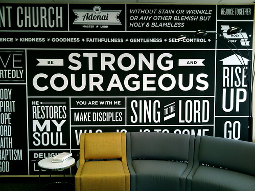
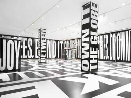
                 Our next idea was inspired from the following video and by typography in general.


After a discussing possible idea with typography we came up with black and white colorscheme and kept our idea of having two contrasting rooms. Furthermore, our main idea is to have one room in white and the other in black. Both of the rooms will have contrasting typography on the walls, quotes from each students, for instance, or something similar. 


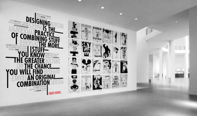
We came up with something like this because we wanted to keep things simple, clean and straight forward. It never goes out of style and if it is done properly it can look exquisit.


We would like to accomplish to make the exhibition look exquisit and to translate our messages and our work in the best possible way.


Group work

As we devided ourselves into groups, we started discussing possible ideas for the exhibition spaces given. After discussing out first idea was to have two contrasting rooms. In addition to that we came across the idea of having one "metal" room and the other "wood".


For the metal room we had in mind to use bits and pieces of metal and create something interesting in the rooms. We wanted to create whole wall covered in metal and than to curve in it logo and lighten it from behind so it pops up and shows what the exhibition is called and what it is about. The other ideas related to the metal room were metal frames holding portfolios or posters, and jar lights.


On the other side, the wood room should have pallets in it reshaped and made differently, and the rooms should be divided by work which will be shown.


My concept for the exhibition spaces brainstorming