Thursday 5 March 2015

Rising Currents


Rising Currents exhibition is exhibition which was given the opportunity to take the creativity beyond the title wall and into the individual displays.

The show contains five different design proposals, presented in united and harmonious way. They used three type sizes for basic information, uniform width for the presentation areas to translate and make the content digestible and accessible. In addition for viewers to interact with the space, they created both conceptual and visual cohesion, and the overall look and type treatment were made to appear similar to blue prints, the architectural form of graphic communication among architect and builders.

There were walls representing a glossary of terms explaining some of the underlying research and data that the teams worked with. With attempt to explain some of the data they connected the definitions for storm surge and flood level terminology with the actual sea level measurements as a better explaining and understanding concept to the visitors.

The colors used are contrasting one with another which made content pop up really good. Furthermore they are really complimenting the content, turquoise blue, black and white. The floor remained simple as it is, which accompanies the layout and simplicity of this exhibition. Architectural elements gave the exhibition a bit of a unique feeling.


Modern graphic design exhibition


Modern graphic design exhibition of a graphic designer Ellen Lupton was held at Cooper-Hewitt, National Design Museum, February 7-May 23, 1995. This monographic exhibition was presenting the work of this pioneering woman designer, focusing on her groundbreaking work designing books, book covers, and signage during the 1950s and 60s. Exhibition was designed by Ellen Lupton with Christine McKee.

The exhibition was placed in a room made out of wood. With that wood- brown color it was combined dark red which looked perfectly. The exhibition was divided so that each part is representing certain par of her work, for example book covers section. 

What i like about this exhibition is that it is very simple but put in a small, bright and well organized room. There is not much details, everything is pointing out at her work. The fact that walls and floor are matching made the exhibition even better.

MAKE:SHIFT | San Jose State University BFA Graphic Design Exhibition 2012


MAKE:SHIFT Graphic design exhibition is the graduating class exhibition presented as a gallery and it was shown in Downtown. SJ. The students were focused not only on conceptual design, but have been branching out into digital mediums like video, after effects and applications design. 

Several of Duarte’s designers from the program- perhaps they’ll add presentation design to the curriculum in the future.

The colors-scheme of the exhibition was mainly blue but combined with a lot of other colors. For presenting the actual design pieces they were using piece of horizontally placed wood with a lot of black sticks popping out vertically. 

The designs were attached to those sticks in order looking like a curtain. Very innovative and interesting to look at. That innovation was kind of center of the exhibition. The other posters were being hanged on the string with clips but in much bigger proportion. 

The interactivity of the exhibition the actual apps which can be tested and viewed by the public was places in the cardboard containers without many graphics, just the name and colorful phone cover. Most of thing at the exhibition were made and placed on cardboard which matched the floor.

"Les cadres", exhibition design, 2009


“Les Cardes” exhibition design, held 2009 was the exhibition held for the Swiss Federal Design Awards, presented at the mudac in Lausanne. The exhibited project are presented through a series of wooden frames leaning on the museum walls. The shapes and sizes of these structures vary depending on the presented medium (graphic design, photography, fashion, product design, jewelry) In the entrance of the exhibition, a specific “information” frame holds all the needed information.

This exhibition has a lot of tones which reminds of modern design of a space. Infinite white, black floor, aluminum tubes, clear and sharp design, etc. The space is very bright which contribute to the whole look of a exhibition. Pop of color here and there brings a certain energy to the certain part of the presented medium. As a pop of interactivity there was a projector, projecting certain designs through the wooden canvas, which looked pretty good and gave the futuristic feeling. The entrance is my favourite part of the show, which represented the exact design and style of the exhibition with all details included.


GUNMAD


GUNMAD is the collaborative name of two graphic designers, Mads Freund Brunse and Gudmundur Ulfarsson. Making the end of their three months residency at Krabbesholm, they arranged an exhibition, showcasing their investigations and experiments. 

Working within with the subjects of learning and language, GUNMAD played with the way we interpret and understand both the written and spoken word. The exhibition is mostly based on typography and using different kind of typography to express certain things. Materials used are mostly paper based and plastic. 

Besides that there is interactivity part of the exhibition, audio parts and some projections. The main focus of the exhibition is the plastic transparent material coming out from the ceiling and laying down the floor with a sentence “You’re talking a lot but you’re not saying anything”.  The whole exhibition s put in a room with white walls and very good lighted up.

Graphic Thought Facility Resourceful Design Art Institute of Chicago[2008]


The Art Institute of Chicago’s first exhibition was presented in a corridor-like gallery where the bespoke display cases adopted the language of institutional notice-boards.

The exhibition scheme combined a vivid palette of lacquered finished with felt linings and anodised cabinet fittings to create a rhythm of shape and color throughout the space. Many of the exhibits were acquired for the museum’s permanent collection

Dark walls behind the cabinets are very good fit for the exhibition, they make designs stand out. Different colors of the cabinets and the lighting placed directly to the designs are a big plus.

Graphic Design Now in Production


Graphic design-Now in production, the largest exhibition in contemporary graphic design was co-organised by Andrew Blauvelt of the Walker Art Center and Ellen Lupton of the Cooper-Hewitt National Design Museum, was held in the United States.

This exhibition “surveys critical highlights from the past decade to signify the expanding role of graphic designers: as editors, authors, curators, publishers, and shapers of content, whose works often frame the process and discipline itself as a tool for production, reflexivity, and praxis.”

Exhibition was installed on the location of 8,000 square foot. In an adjacent hallway, an overview of the exhibition samples works from each of its thematic sections. The exhibition itself is organized as a set of thematic corridors as well, partioned by black geometric voids that anchor exhibition furniture originally designer and fabricated for the Walker installation. It combines new and old, clean and rough, into a dense exhibition experience spanning the gamut of contemporary graphic design production.

The font used throughout this exhibition, as i found is Helvetica and Arial. The sections of the exhibitions were offering among others visitor participation, in-gallery shopping and smartphone-readable QR code. It was found very innovative and something not seen yet.

There are nicely organized materials such as: posters, magazines, information graphics, books, film titling and other motion graphics, typography and typefaces, branding and identity. The way of presenting the work at the exhibition was followed by clean contemporary design with bespoke display furniture, two-dimensional work under glass, large computer screens for displaying interactive media, screen-printing posters, over-sized charts and diagrams, etc.

Graphic Design Festival Breda


Graphic design festival Breda is a poster exhibition. This exhibition was made out of complexion of the posters perfectly arranged coming out from the ceiling.  Posters are perfectly placed one next to the other with piece of wood on the bottom and the top.Background was mostly white but not everywhere the same. Since the exhibition was held in a place which has very high ceiling there is a lot of natural light. White walls are posted behind the posters so the posters will stand out.

Affiches françaises exhibition


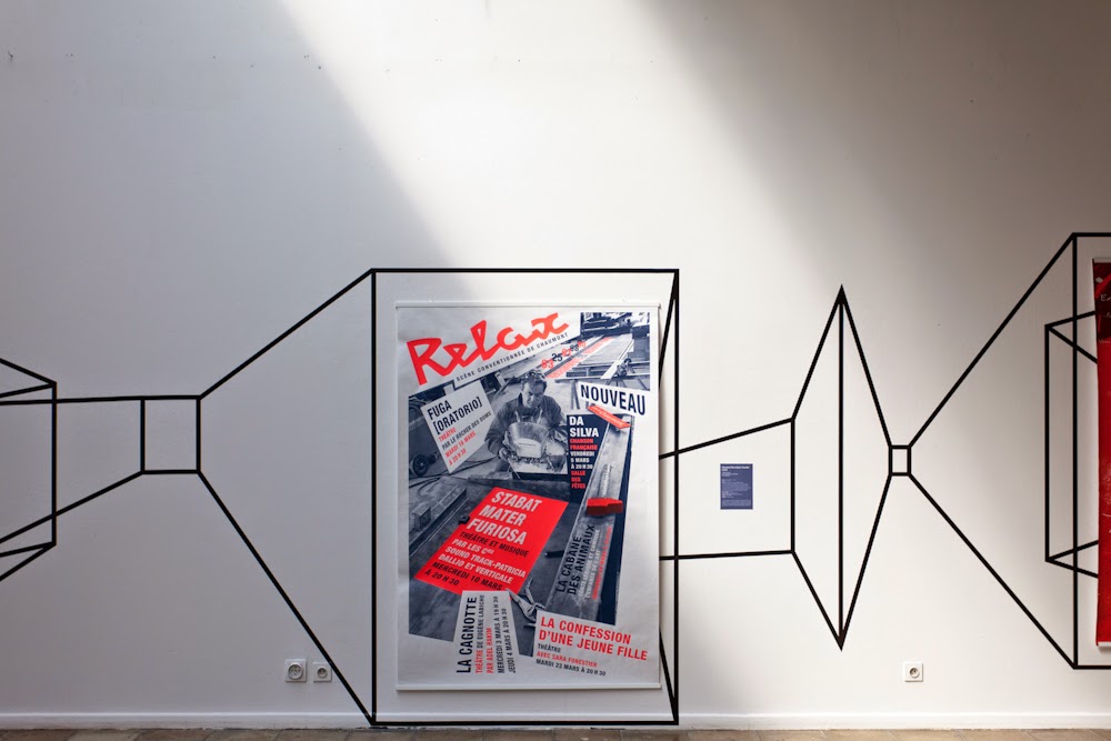
Affiches francaises exhibition is exhibition with very different style of presenting things. This exhibition uses one room with big white walls and floor with tiles. 

The walls are being drawn with black lines which are connected with the designs, doors, widows, and the title of the exhibition. Black lines are all over the room going in circle and making certain shapes. Designs shown inside the lines are bright with a lot of colors. This kind of shaping and drawing on the walls is kind of interacting with the viewer and catching the eye to flow through the room. What I would do to make the drawing and designs pop up even more, i would make floor in white color as well, so the place would look like the infinite white.