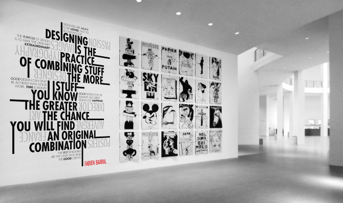
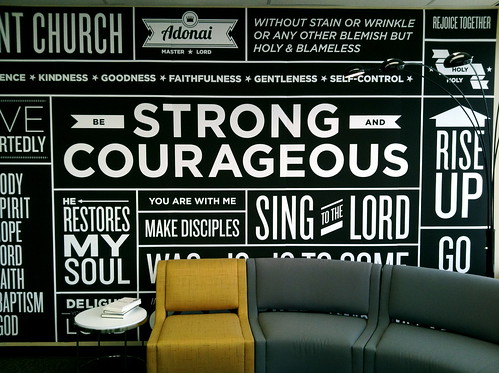
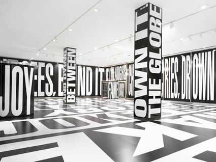
Our next idea was inspired from the following video and by typography in general.
After a discussing possible idea with typography we came up with black and white colorscheme and kept our idea of having two contrasting rooms. Furthermore, our main idea is to have one room in white and the other in black. Both of the rooms will have contrasting typography on the walls, quotes from each students, for instance, or something similar.


We came up with something like this because we wanted to keep things simple, clean and straight forward. It never goes out of style and if it is done properly it can look exquisit.


No comments:
Post a Comment